Layouts that follow the idea
What your zine is about can suggest an approach for the whole thing. The order of the pictures then decides each spread.
Two decisions, at two sizes
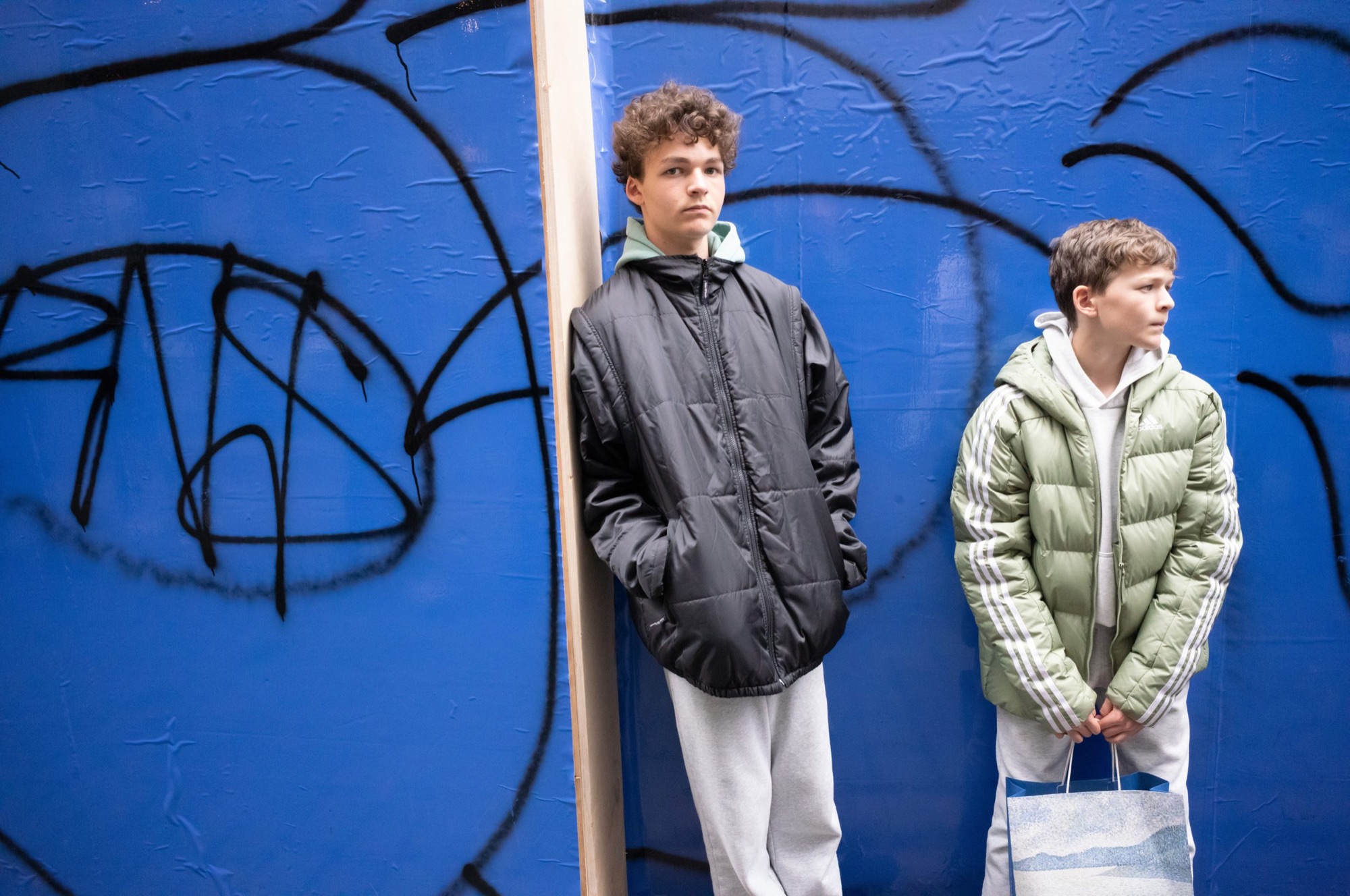
A layout is where a photograph sits on the page, and how big it is. There are two good reasons to choose one: what the zine is about, and what comes just before and after. They don’t compete, because they work at different sizes.
The idea can set an approach for the whole zine: how much white there is, how large the pictures run and how many layouts you use. The flow, meaning the order you’ve found, decides each spread (two facing pages): this one small, that one large, a blank page here.
Libby Jeffrey, writing in the trade magazine Inside Imaging, suggests judging a design by whether it “reflects what the work demands”. Grant Scott, a lecturer and the founder of the United Nations of Photography, says there are no rules about layout, and advises letting the photographs lead.
What the idea can decide
Sometimes sameness is the point. Bernd and Hilla Becher photographed industrial structures such as cooling towers and blast furnaces from a similar viewpoint, under overcast skies, and arranged the pictures in grids. Fraenkel Gallery notes that, shown together this way, subtle differences appear among structures that look alike. A zine that compares things, keeps a record or follows a daily habit may want the same evenness: one size, one position, every picture given equal weight.
Sometimes space is the point. Jeffrey describes a mainly American tradition, naming Walker Evans’s American Photographs and Robert Frank’s The Americans: simple and linear, like an exhibition in book form, usually with a blank left page and the picture on the right. It is set against a Dutch tradition that is more cinematic and playful with form, with designer and photographer working closely together. The author is open that this comparison comes from limited research, but it’s a useful pair of poles.
The idea can also reach the smallest details. In the same article, the designer Catherine Griffiths is reported as saying that the typography of Bruce Connew’s I Must Behave responds to the book’s idea of control, with the title set on its side.
If you’ve worked out what your zine is about, a few questions can help. Is it closer to a record or a feeling? Should every picture weigh the same, or should some be louder than others? Do you want the reader to look at things from a distance or to feel inside them?
What the flow decides
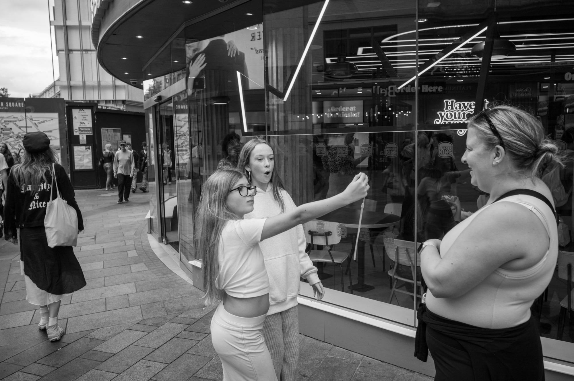
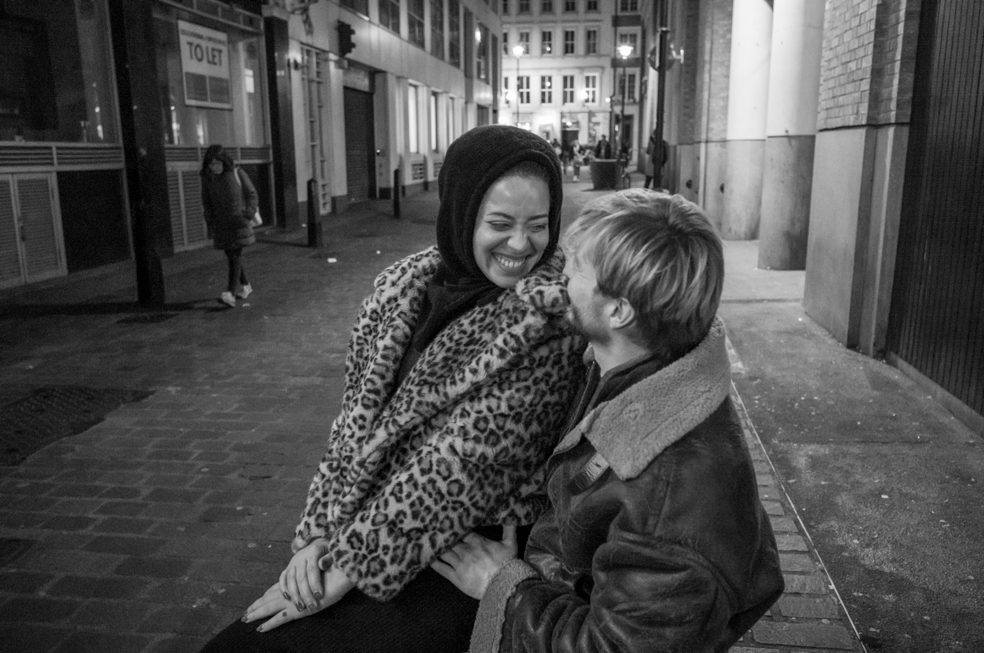
Within that approach, each spread can respond to what’s around it. Jeffrey quotes the designer Teun van der Heijden, who warns that simply choosing the best 50 pictures makes for a dull book, because the tension stays the same. A book needs to build tension and release it, as a film or novel does. White space and blank pages act as punctuation, giving the reader a moment to reflect.
So a layout can answer what has just happened. After several large pictures, a small one lets the reader breathe. After many small ones, a large one lands. Michael Almereyda, reviewing Paul Graham’s a shimmer of possibility, notes one picture of a man pushing a lawn mower in light rain, printed at twice the size of the others, which lets you take in more of what’s there. Pacing and rhythm and Pairs across a spread go further into this.
The idea picks the approach. The sequence picks the page.
When the two pull apart
Sometimes the flow wants a big picture where the idea wants restraint. It can help to ask what the reader would miss. If the large picture is there only because it’s a favourite, the idea probably wins. If the sequence goes flat without it, the exception may be worth making, and one exception will stand out more in a zine that is otherwise even.
Tim Parkin, writing about the design of a landscape photography book in On Landscape, recommends varying the size, alignment and spacing of photographs, and also says you don’t need to be a slave to a layout, because the eye forgives a little variance. Jeffrey’s conclusion is that design should support the book’s intention and never take away from the photography.
Starting with three or four layouts is one way to hold on to that, adding another only when a picture asks for it. If you run a photograph to the edge of the page, Parkin’s caution applies: a couple of millimetres are lost where the picture meets the edge, so keep important detail away from it. Sending your zine to print explains the 3 mm bleed (the extra picture that’s trimmed away).
Sources and further reading
- Libby Jeffrey, “Photo book design tips from experts”, Inside Imaging (21 December 2018): design and intention, the American and Dutch traditions, Teun van der Heijden on tension, white space as punctuation, and Catherine Griffiths on I Must Behave.
- Spencer Museum of Art, Blast Furnaces, Bernd and Hilla Becher: viewpoints, overcast skies and grids.
- Fraenkel Gallery, “Bernd & Hilla Becher: Typologies”: what the grid shows.
- Michael Almereyda, “Paul Graham: A shimmer of possibility”, American Suburb X (2010): the picture at twice the size.
- Tim Parkin, “Natural Landscape Photography Awards book: book design decisions”, On Landscape (10 January 2022): varying size and alignment, variance between pages and full-bleed pictures.
- Grant Scott, “How to produce a photo book: a simple 12-step guide”, United Nations of Photography (31 August 2026): no rules about layout; letting the photographs lead.