Pacing and rhythm
A zine is read at the speed its pages set. Where to let the reader slow down, and where to move them on.
A zine has a speed
Nobody reads a zine one picture at a time with the same attention for each. They move quickly through some pages and stop at others, and that speed is something you set, whether you mean to or not. Pacing is the name for it: how fast the pages ask to be turned, and where they ask the reader to stop.
Many photobook makers reach for music to describe it. The book artist Keith Smith, whose Structure of the Visual Book is one of the standard texts on the subject, says his ideas about sequencing came from sonatas and symphonies rather than from other photographers. His example is a familiar tune played with every note at the same volume and spacing. The individual notes, he says, are not that important; the pacing is. “Pacing, mood, pauses, building to climaxes are just as critical as the meaning within each individual picture.”
Andrew Molitor, writing about sequencing, puts it the same way: “I liken sequencing a photobook to writing a piece of music”, with quieter pictures building to something more dramatic and then calming down again. You can, he says, develop a whole book around rhythms like that, thinking in terms of interludes and crescendos. A zine of 24 or 32 pages has room for one or two of each.
Loud pages, quiet pages
The first thing pacing asks of the edit is that not every picture be a strong one. Alec Soth, looking back at Sleeping by the Mississippi, said its weak point was “the lack of in-between pictures”: “too many iconic images following iconic images with no softer pictures in between.” Will Vogt, whose book Behind the Hedges was edited down from 140,000 photographs, describes the job the same way: “There has to be movement, images that open things up, images that slow things down.” A book, he says, is not a greatest hits collection, and sometimes the quieter images serve the story better.
That changes what a quiet picture is for. On its own it may not say much. In a sequence it earns its place by what it does to the pictures either side of it: it gives the reader a breath, and it makes the next strong picture stronger. If every spread shouts, none of them is heard.
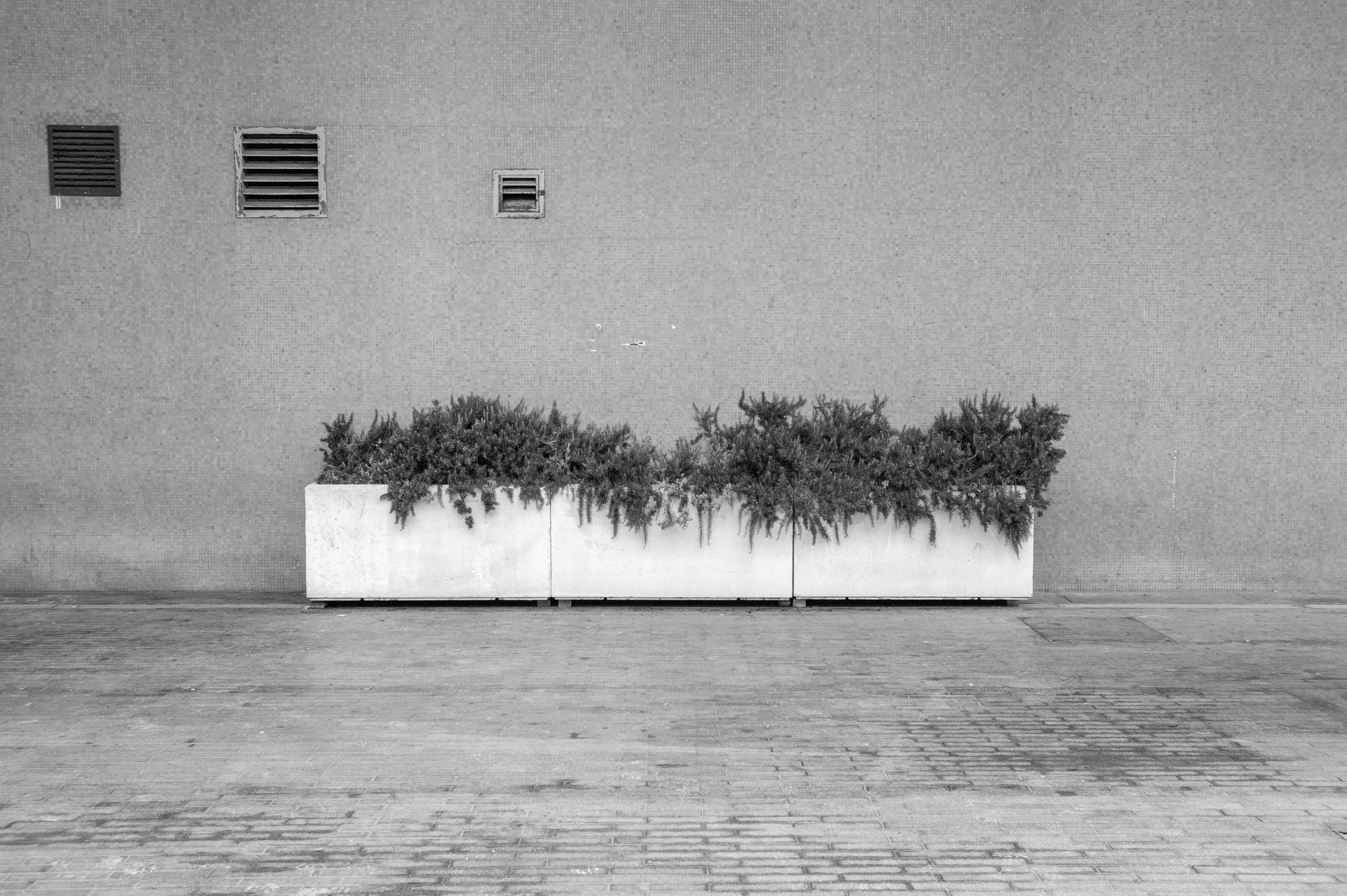
A strong picture needs a quieter one before it, or it has nothing to be stronger than.
Size and white space
Pacing is set by the pages as much as by the pictures. Teju Cole, describing how he sequences his own photobooks, says the questions involve “slowness, quietness, surprise, continuity, rhythm, repetition or near repetition”, and then the sizes of the images and the use of white space. Those last two are the tools a zine maker has most control over.
Paul Graham’s a shimmer of possibility (2007) is the clearest example of them at work. It is twelve small books of the same size, each a short story of everyday life, and they vary in length from a single photograph to 60 pages of pictures made on one street corner. Reviewing it, the film-maker Michael Almereyda noticed blank white pages used to stagger the flow, one picture printed twice the size of the others so you can take in more of it, and nearly identical pictures printed on facing pages; he found “a musical impulse guiding Graham’s layouts”.
In a stapled zine the same instruments are available. A photograph across both pages, bleeding off the edges, is the loudest thing a zine can do; a full page is next; a small picture on a white page is quieter still; and a white page is a rest. Changing the size of a picture changes the time the reader gives it. Changing the size from one spread to the next is what gives a zine its rhythm, rather than a steady march of same-sized pages.
White space cuts both ways. A white page facing a single picture gives it room and slows the reader down. A run of near-empty spreads does the opposite: Molitor notes that you can speed the reader up with repeated or similar content, or with blank space, because there is nothing to hold them. Neither is a mistake. It depends on whether you want the reader to stop here or to get somewhere.
Repetition and the beat
Repeating something sets up a beat. Two pictures of the same subject on consecutive pages, or nearly the same picture twice, tell the reader that time is passing slowly, that you are staying with this. Graham does it openly: in one of his twelve books Almereyda counts seven pictures of the same woman and eight of the sky. A third picture of the same thing turns a pair into a pattern, and the reader begins to expect the next one. That expectation is yours to keep or to break.
Smith borrows the idea from Wagner, who used a few notes to stand for a character or a place and brought them back through the work. A picture that returns later in a zine, changed a little, does the same thing: the reader recognises it, and the recognition ties the pages together. There is more on this in Recurring motifs. The thing to avoid is accidental repetition, two similar pictures a few pages apart that were not meant to speak to each other. Those usually mean one of them belongs back in the edit.
Smith also says that the gaps between the pictures must be composed, and that many things are left unsaid, to be filled in by the reader. A page turn is such a gap. What the reader sees last before turning, and first after, is a decision as much as the pictures themselves. Flip through a dummy (a rough printed copy) and watch where your own hand speeds up.
Sources and further reading
- Lesley A. Martin, “How to Make Books that Sing Like Sinatra”, an interview with Keith Smith, The PhotoBook Review 015, Aperture (31 January 2019): pacing, pauses and climaxes; music as the model; the gaps between pictures.
- Andrew Molitor, “Sequencing: Part I”, Luminous Landscape (2017): sequencing as music, interludes and crescendos; speeding the reader up with similar content or blank space.
- British Journal of Photography, “Alec Soth is Sleeping by the Mississippi” (November 2017): the “in-between pictures”.
- Martin Kaninsky, “Will Vogt turned 140,000 images into one story”, About Photography: movement, images that open up and slow down, quieter images serving the story.
- Alice Zoo, interview with Teju Cole about Pharmakon, Granta (2024): the questions sequencing asks, image sizes and white space.
- MACK, a shimmer of possibility by Paul Graham: twelve books, identical in trim size, from a single photograph to 60 pages.
- Michael Almereyda, “Paul Graham: A Shimmer of Possibility”, American Suburb X (2010): blank pages to stagger the flow, a picture at twice the size, near-identical facing pages, the musical impulse.