Preparing your photographs for print
A short checklist to run through before you add your photographs to the studio. Paper shows less than a screen does, so a few minutes here helps the printed zine look the way you meant it to.
The checklist
Screen turned down
Judge your photographs with the screen brightness lowered. A bright screen makes pictures look lighter than they are, so they print dark. A white page on screen should look about as bright as a sheet of white paper beside it.
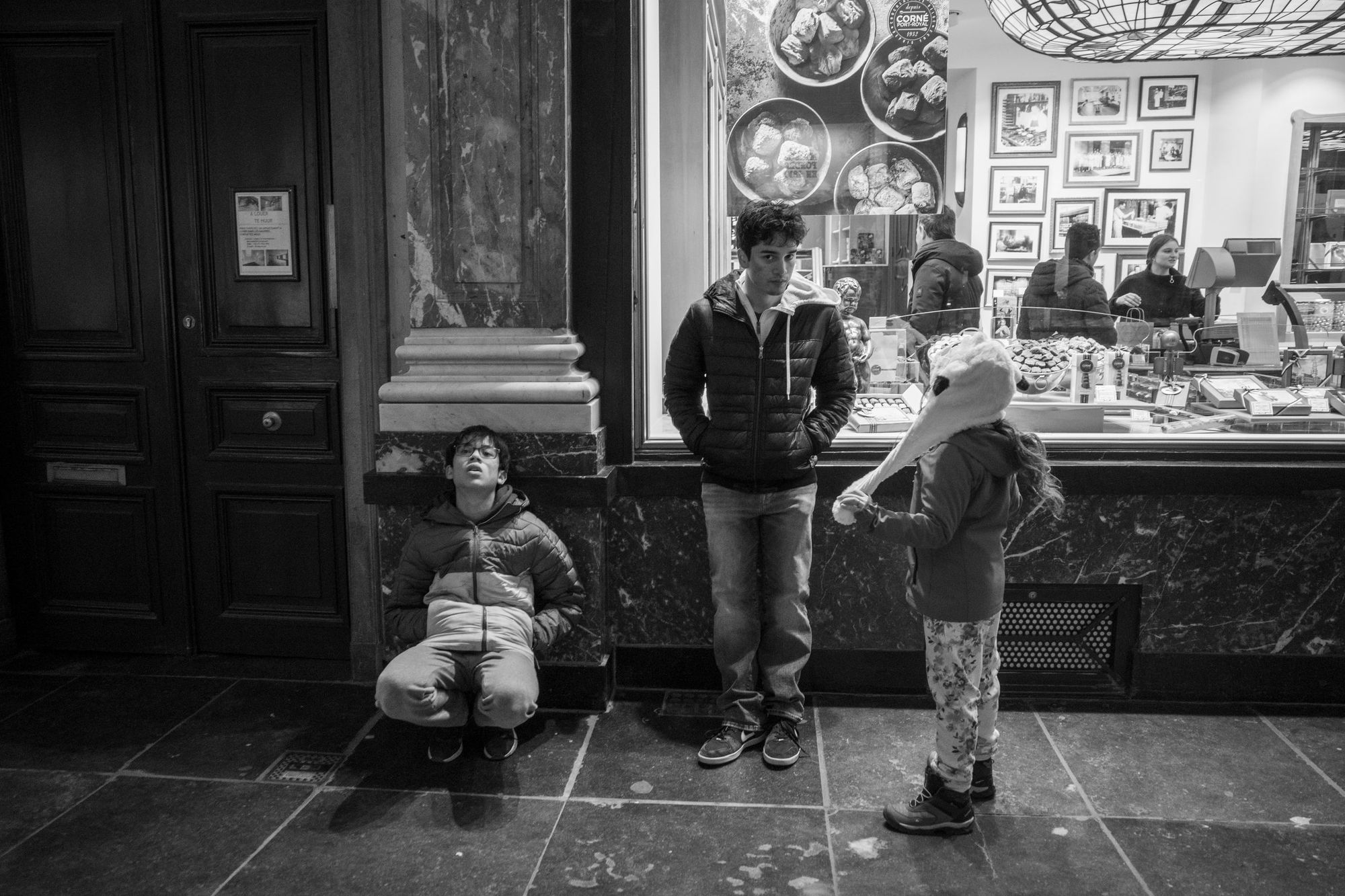
Shadows you care about are lifted
Ink spreads a little on paper, so the darkest areas fill in, more so on uncoated paper. If there’s a face in a doorway the reader should see, lighten that shadow slightly.
Highlights keep a little tone
The palest greys can print as bare paper. Keep a trace of detail in skies and white walls you want to show.
Black and white is neutral
Greys printed with four inks can drift pink or green. Keep black-and-white pictures neutral, or tone the whole set the same way.
The set matches
Look at all the pictures side by side. One that is much brighter or warmer than the rest will stand out on the spread.
Big enough to print
For a full A5 page, about 1,800 × 2,550 pixels. For a full A4 page, about 2,550 × 3,600. The studio marks anything too small with a Low res tag.
Saved as a high-quality JPEG
With the colour profile embedded. sRGB is the simplest choice. Phone HEIC files and TIFFs don’t open in every browser.
Not over-sharpened
Sharpen as you would for a crisp screen image, a little more for uncoated paper. Print hides some sharpening, so judge it on paper, not on screen.
Checked on paper
Print the free Print at home PDF and look at your darkest pictures first. For the paper and ink themselves, order one copy from your printer before the rest (see Sending your zine to print).
Sources and further reading
- Jeremy Gray, “The keys to perfect prints: Monitor calibration & color profiles”, Imaging Resource (31 January 2023): why a screen that is too bright leads to prints that are too dark, and how bright a screen should be for print work.
- Cambridge in Colour, “Guide to image sharpening”: sharpening for print, why it’s hard to judge on screen, and why matte papers need more.
- Cambridge in Colour, “sRGB vs. Adobe RGB 1998”: which colour space suits 8-bit files such as JPEGs.